The Hertzsprung-Russell diagram, abbreviated as H–R diagram, is often considered the most important tool in revealing the relationship between a star's absolute magnitude - or luminosity, verses stellar classification - effective temperature. In essence colour/temperature plotted against brightness. The development of this diagram led to a far greater understanding of stellar evolution for varied types of stars.
The diagram was created independently in 1911 by Ejnar Hertzsprung and by Henry Norris Russell in 1913. Neither knew of each other’s work, which stemmed from nineteenth century large-scale photographic spectroscopic surveys of stars performed at Harvard College Observatory (see In Focus - May), producing spectral classifications for tens of thousands of stars, culminating in the Henry Draper Catalogue.
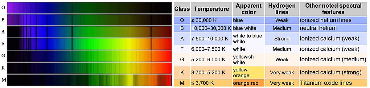
Stellar spectrum composition, class and data. (Click to enlarge)
In one section of the work, astronomer Antonia Maury included stellar divisions categorized by the width of their spectral lines. Hertzsprung noted that stars described with 'narrow lines' tended to have smaller proper motions than others of the same spectral classification and took this as an indication of greater luminosity for such stars. He computed parallaxes for several groups of these, allowing him to estimate their absolute magnitude. Hertzsprung's findings with such initial diagrams were not published until 1911 and used the apparent magnitudes for clusters of stars at the same distance.
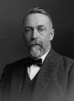
Ejnar Hertzsprung
Henry Russell had also spent time comparing the luminosity and spectral type of stars in the years before 1913, realising the key to this was determining stellar distances before the absolute magnitude could be established.
Russell's early (1913) version of the diagram included those giant stars identified by Hertzsprung in Maury's data. This was obtained by using parallax measurements of such stars in nearby open clusters, in particular the Hyades cluster in Taurus, where distance and apparent magnitude was already known to derive absolute magnitudes for those stars. Thus, the H-R diagram was conceived, two scientists coming to the same conclusions from slightly different angles, but from the same original data.
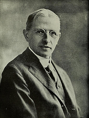
Henry Norris Russell
Following Russell's presentation of an early diagram to a meeting of the Royal Astronomical Society in 1912, Arthur Eddington was inspired to use it as a basis for developing ideas on stellar physics.
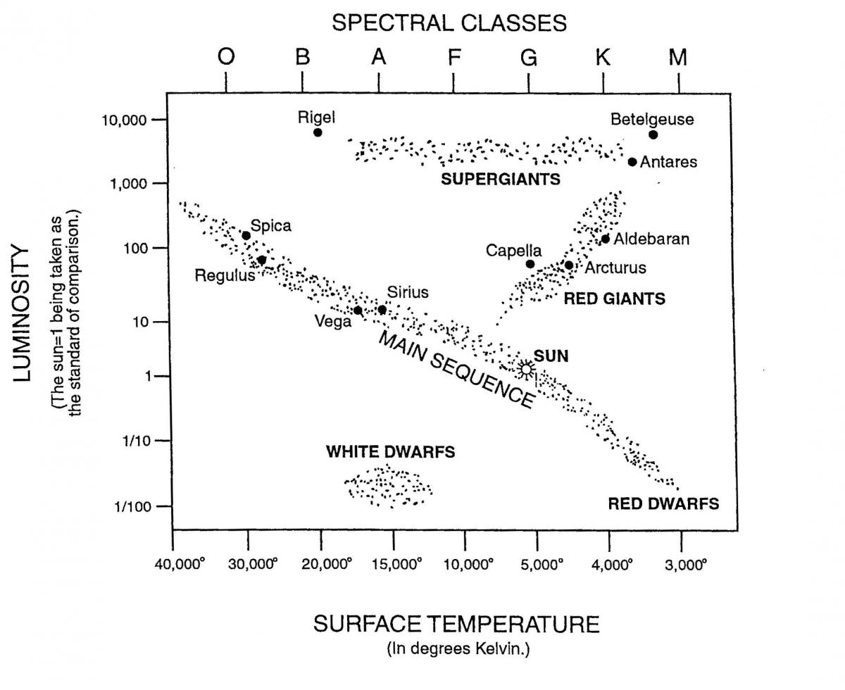
Simple line H-R diagram with axis denoted (Click for larger image)
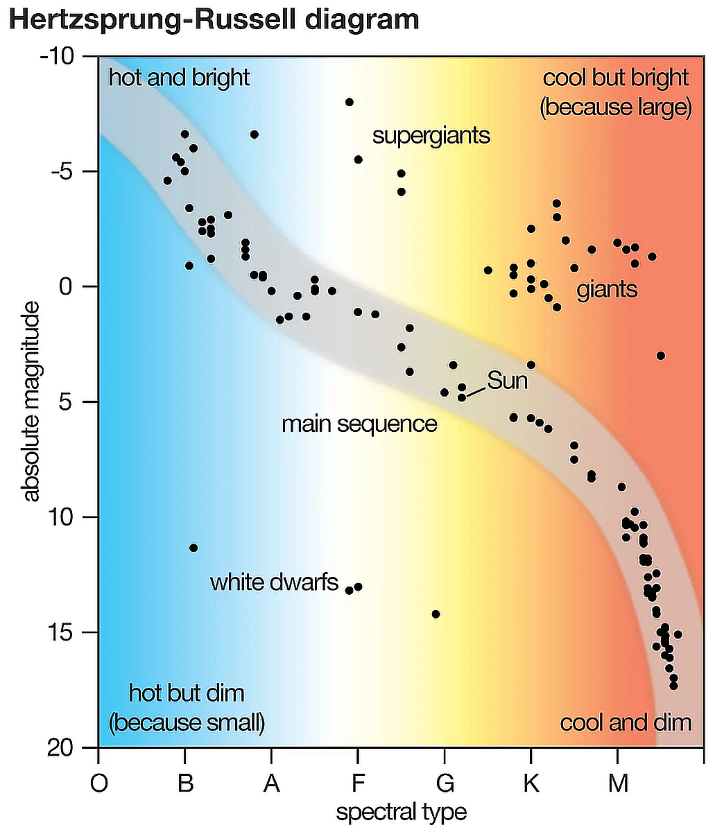
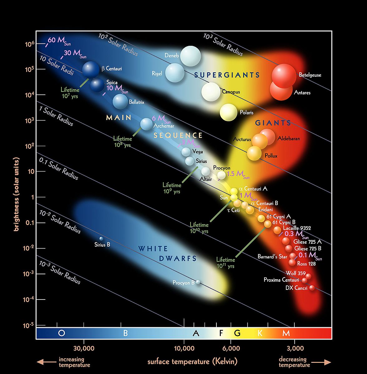
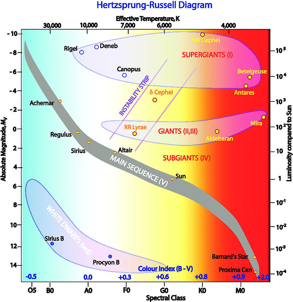
The H-R diagram is quite easy to understand if you can interpret what each axis means. The horizontal axis measures the surface temperature of the star in Kelvin. Stars on the right of the horizontal axis are cooler and redder in colour than the stars on the left, with temperatures of around 3000 Kelvin as opposed to 25,000 Kelvin upwards. The vertical axis on the left measures luminosity using the Sun as our comparison. So, a luminosity of one is equal to one Sun. The vertical axis on the right measure’s absolute magnitude, or brightness, crucially considering a star’s distance. The bottom axis identifies spectral type, or, spectral class of a star, which is another way to describe the colour and temperature.
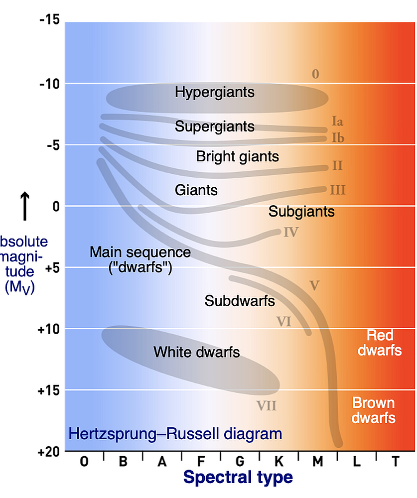
The layout of these axis is for 'model' H-R diagrams, but often the axes are transposed - left to right and up and down - so there are numerous variants! As we saw in last month's In Focus, the different letters represent different colour and temperature ranges. Most of the stars occupy the diagonal region in the diagram along the line called the main sequence.
Stellar class - temperature (colour) representation of H-R diagram
Stars form in molecular clouds, composed chiefly of hydrogen and dust (think Orion molecular cloud and Orion nebula). Any kind of shock wave that may arise, perhaps from a nearby supernova, or gravitational fluctuations from the passage of galactic spiral arms, would compress any such clouds leading to an increase in temperature within. In time, this would lead to the formation of protostars within the densest cloud clumps. Continued compression results in higher temperatures still and once 15-20 million degrees is reached, the process of fusion begins, fusing hydrogen into helium. The new star 'switches on' and joins the main sequence.
Embryonic stars which fail to start the process of fusion are known as Brown dwarf stars - failed stars. Just where a star joins the main sequence is dependent on how massive it is - ie how much matter initially went into its makeup. For instance, you could have a low mass star like our Sun, or a massive blue star (which as we saw last month are much hotter), or even a red dwarf star, which is far smaller and dimmer than our own Sun.
Stellar Type location on the H-R diagram (Click for larger image)
As stars age and eventually fuse all the hydrogen to helium at the core, helium burning will then commence (with the 'helium flash') and the star moves off the main sequence band. All fusion stars apart from red dwarfs do this. Heavier elements are fused in ever decreasing time frames as the star grows older. Low-mass stars, like our Sun, will eventually turn into orange/red giant stars, before the star’s atmosphere begins to fizzle away and it becomes a planetary nebula. The left-over 'core' of the star is called a white dwarf - a hot, but degenerate planet sized star, which will take billions of years to fade and cool down to a black dwarf. More massive stars evolve quicker, so supergiant stars such as Betelgeuse and Rigel in the constellation of Orion, have far shorter lives. Such stars become unstable once iron starts to form inside the core and explode as supernova. Their final fate will depend upon its mass, turning into either a black hole, or more likely a neutron star.
With some basic understanding of the life cycle of a star, stellar evolution can be identified by utilising the HR diagram.
Solar mass, size and lifespan plotted on H-R diagram. (Click for larger image)
Looking at the various 'regions' on the H-R diagram, the largest concentration of stars lies on the main sequence. The next concentration of stars falls on the horizontal branch (helium fusion in the core and hydrogen burning in a shell surrounding the core). Another prominent feature is the Hertzsprung gap, located in the region between A5 and G0 spectral type stars, and between +1 and −3 absolute magnitudes (i.e., between the top of the main sequence and the giants in the horizontal branch). RR Lyrae variable stars can be found in the left of this gap on a section of the diagram called the instability strip. Cepheid variables also fall on the instability strip, but at higher luminosities.
The various regions of stellar evolution on the H-R diagram. (Click for larger image)
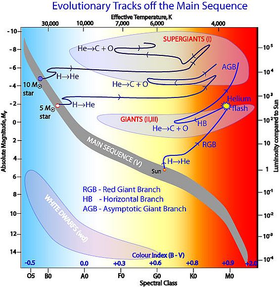
The evolution of various mass stars on the H-R diagram can be seen on the diagram below. Definitions of various terms used on the diagram are as follows.
MS - Main sequence stars (spectral type V) fuse hydrogen into helium in the core. When the hydrogen in the core is depleted, the star becomes an RGB star.
RGB - Red Giant Branch stars (V->II/III) fuse hydrogen into helium in a shell around the core. At some point, called the Helium flash, the core temperature becomes high enough to start fusing helium into carbon and oxygen, the star then becomes an HB star.
HB - Horizontal Branch stars (II/III) use helium into carbon/oxygen in the core. A shell with inert helium surrounds the core, which in turn is surrounded by a hydrogen burning shell.
AGB - Asymptotic Gian Branch stars (I) have a carbon/oxygen core with several inert or fusion shells around it.
As can be seen, the evolutionary path for stars of fundamentally different mass is quite complex, sometimes resulting in stars plotted in the same general area of the diagram, even though they are of very diverse ages.
The H-R diagram can also be used by scientists to roughly measure how far away a star cluster, or even, galaxy is from Earth. This can be done by comparing the apparent magnitudes of the stars in the cluster to the absolute magnitudes of stars with known distances (or of model stars). The observed group is then shifted in the vertical direction, until the two main sequences overlap. The difference in magnitude that was bridged to match the two groups is called the distance modulus and is more or less, a direct measure for the distance. This technique is known as main sequence fitting and is a type of spectroscopic parallax.
Far from being just an eye-catching diagram, with some basic understanding of the life cycle of a star, the H-R diagram can become a powerful tool in stellar classification, evolution and, even distance modelling. Amazing!
- Log in to post comments